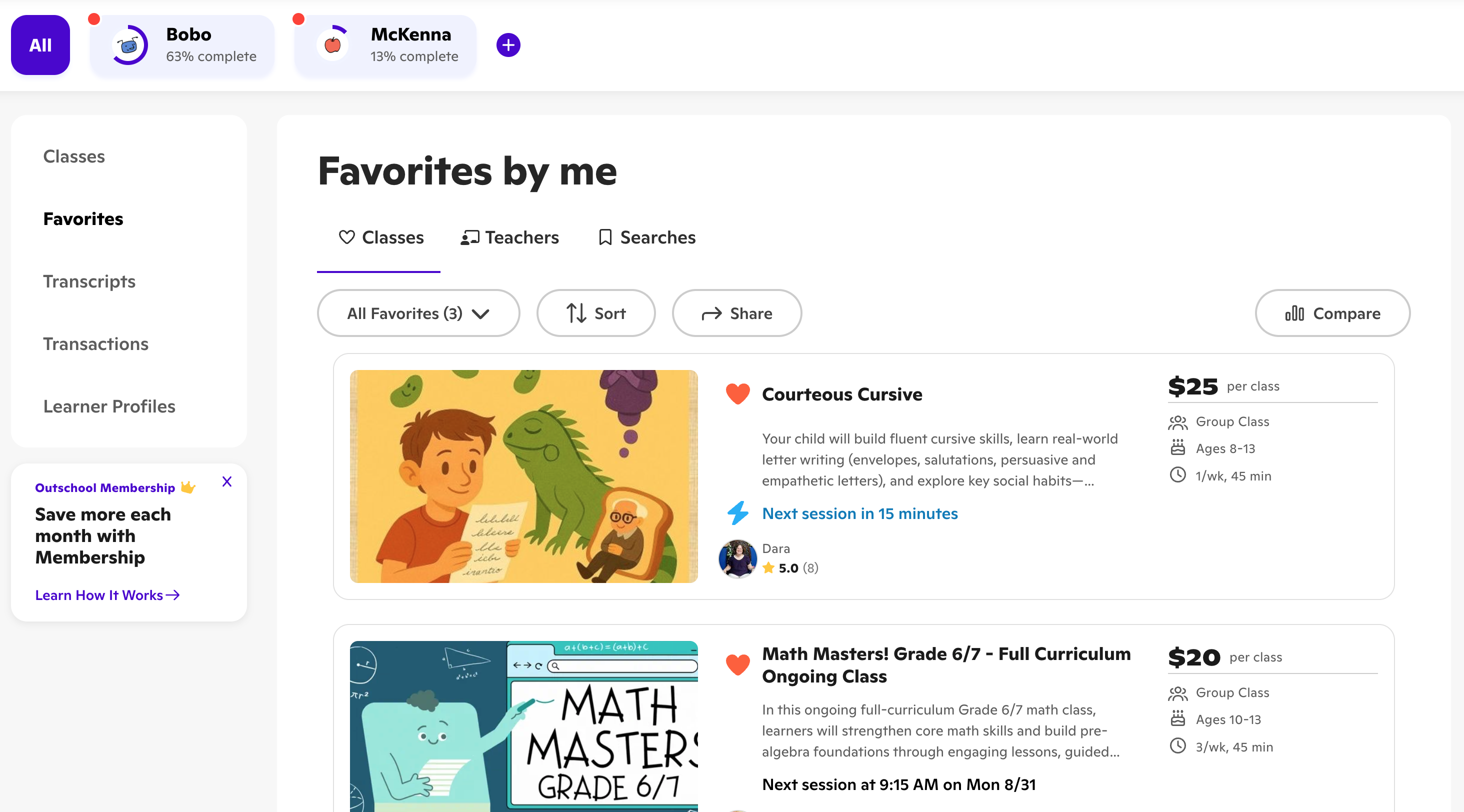
I rebuilt the dashboard
2–3 clicks · to any core job
The dashboard was an afterthought, and users treated it like one. They left it to get anything done. I rebuilt it so the core jobs live in one place, two or three clicks away.
The problem
Outschool's dashboard was effectively useless. You could not change payment, enroll in a class, adjust an enrollment, or message a teacher from one page. Even joining a class was confusing.
We interviewed dozens of users. They confirmed it. The dashboard was an afterthought, and they had built workarounds to do their core jobs.
What I did
Redesigned the dashboard and the settings pages behind it, on top of a pile of design and tech debt. The bar was simple: pull the scattered actions into one place and make every core job reachable in two or three clicks.
What moved
Dashboard usage rose. Time to finish a core job dropped. Users said so too.
No single headline number here. The direction was clear and consistent across all three.